⚠️

This portfolio is optimized for larger devices. A minimum screen width of 1280px is recommended.

Design System documentation page with a dark blue header displaying Design System and Themes. The main content area is white and features the heading Themes, followed by explanatory text about light and dark themes, default and dark theme descriptions, and example UI screenshots showing different theme applications. The environment is clean and professional, conveying clarity and organization. Visible text includes section headings such as Themes, Default Theme, Dark Theme, and descriptions of grouping content within boxes.

Standardizing Design, Without Sacrificing Flexibility

To support McKinsey & Co.'s growing suite of internal tools, I helped build a modular design system that streamlined workflows, reduced inconsistencies, and empowered teams to move faster—without compromising on customization.

Project Overview

  • Client: McKinsey & Company
  • Role: Product Designer
  • Focus: Design Systems, UI Consistency, Developer Collaboration

The problem

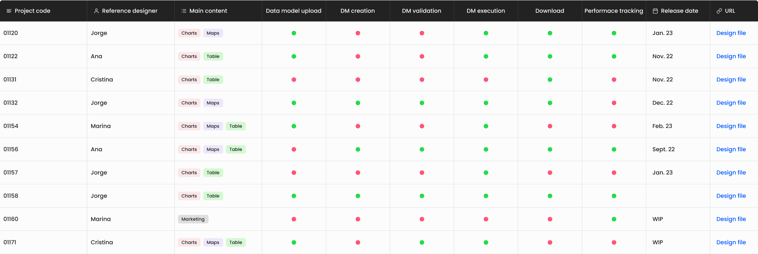
As McKinsey continued to request more internal tools—primarily focused on data visualization—we noticed a recurring issue: every tool was being designed as a standalone product, even though their structure, components, and user needs were largely similar.

This led to:

  • Inconsistent user experiences, despite similar functions.
  • Inefficient design and dev processes with teams repeatedly solving the same problems.
  • Lack of scalability, as new projects required ground-up design efforts each time.

The Goal

To create a flexible, modular design system that could:

  • Standardize design across all internal tools.
  • Improve design and dev velocity.
  • Support consistency without sacrificing customization.
  • Reduce duplicated effort across product teams.
Design System documentation page showing a dark blue header labeled Design System and Themes. The main content area is white and features the heading Themes, followed by explanatory text about light and dark themes, default and dark theme descriptions, and example UI screenshots displaying different theme applications. The environment is clean and professional, conveying clarity and organization. Visible text includes section headings such as Themes, Default Theme, Dark Theme, and descriptions of grouping content within boxes.
Table from the audit, showing components usage across different products.

The Approach

We started with a deep audit of all tools developed to date, analyzing:

  • Recurring UI problems and design decisions.
  • Overlapping patterns, layouts, and interaction models.
  • Gaps in scalability and branding cohesion.

This research helped us define a prioritized list of components and patterns based on usage frequency and complexity.

Design System documentation displayed on multiple screens, each showing different sections such as Main palette, Disabled Colors, and Non-interactive elements. The screens feature a clean, professional layout with blue headers, white backgrounds, and organized color swatches and text. Visible text includes headings like Main palette, Disabled Colors, Non-interactive elements, and section labels such as Main colors, Support colors, Content Block Background, and Dark Theme. The overall tone is orderly and informative, emphasizing clarity and structure in the design system presentation.
Documentation screens showing atoms.

Structure of the Design System

The system was broken down into three main libraries to support different project needs:

  • Foundations: Colors, typography, grids, spacing, iconography.
  • Components: Buttons, inputs, cards, dropdowns—all built with variants and documented states.
  • Patterns: Navigation, filtering, modals, microinteractions, and transitions.

Each element was documented for both designers and developers, with guidance on usage, accessibility, and responsiveness.
We supported light and dark themes, allowing product teams to adapt visual style without rebuilding core logic.

Multiple screens displaying a design system documentation interface with dark blue headers and white content areas. The screens show sections such as Alignment and Button Icon, with explanatory text, diagrams, and UI examples including buttons, maps, and form layouts. Visible text includes headings like Alignment, Button Icon, and Design System, as well as descriptive paragraphs and labels for UI elements. The environment is clean, organized, and professional, emphasizing clarity and structure in presenting design guidelines. The tone is informative and methodical, supporting understanding and accessibility for users and developers.
Documentation screens showing components and guidelines.

Balancing Standardization with Flexibility

The biggest challenge? Creating generic components that were robust enough for reuse, yet flexible enough to allow project-specific customization.

To solve this, we:

  • Created highly modular, atomic components with clear variant logic.
  • Used patterns instead of rigid organisms to build complex experiences.
  • Allowed teams to import only what they needed (e.g., just foundations for full custom UI).
Three diagrams illustrating different design system architectures. The first diagram shows a single design system with three blocks labeled F for Foundations, C for Components, and P for Patterns. The second diagram displays the same three blocks grouped together, with lines connecting to four separate projects labeled Project A, Project B, Project C, and Project D, each using different color schemes. The third diagram separates the Foundations block from the Components blocks, showing Foundations connected to four distinct component libraries, each of which connects to a different project. The diagrams use blue, pink, and teal colors, and the environment is clean and professional, emphasizing clarity and organization. Visible text includes DESIGN SYSTEM, Foundations, Components, Patterns, Project A, Project B, Project C, and Project D. The tone is informative and structured, supporting understanding of modular design system strategies.
Modular design system diagrams showing shared and custom components.

Cross-functional Collaboration

Close collaboration with engineers was critical from the start:

  • Worked together to define a basic design token system as a bridge between design and development.
  • Aligned on technical feasibility early, shaping component behavior around real implementation constraints.
  • This partnership allowed us to speed up dev time and reduce post-handoff friction.

The Outcome

  • Significantly reduced design and dev time for new tools.
  • Established a shared language between designers and developers.
  • Created a scalable foundation for all future internal product work.
  • Enabled a smoother onboarding process for new team members.