


This portfolio is optimized for larger devices. A minimum screen width of 1280px is recommended.

Building An Inpiration Feed for The Knot
Driving a 7.9% lift in favorites and 6.9% more vendor saves by creating an in-app discovery experience that makes inspiration actionable.
Background and context
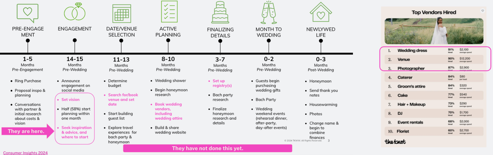
Recent market insights, user research, internal surveys, and focus group sessions all pointed to the same opportunity: a mobile-first Inspiration Feed. Users today behave very differently on mobile:
- They discover ideas passively, by consuming content rather than searching for it.
- They rely heavily on visual platforms like Pinterest, Instagram, and TikTok for wedding ideas.
- On The Knot app, the top actions are browsing, favoriting, and consuming inspiration and advice.
Yet, The Knot lacked a modern, scrollable, visually rich discovery experience — causing couples to leave the app for inspiration, and then come back to plan.
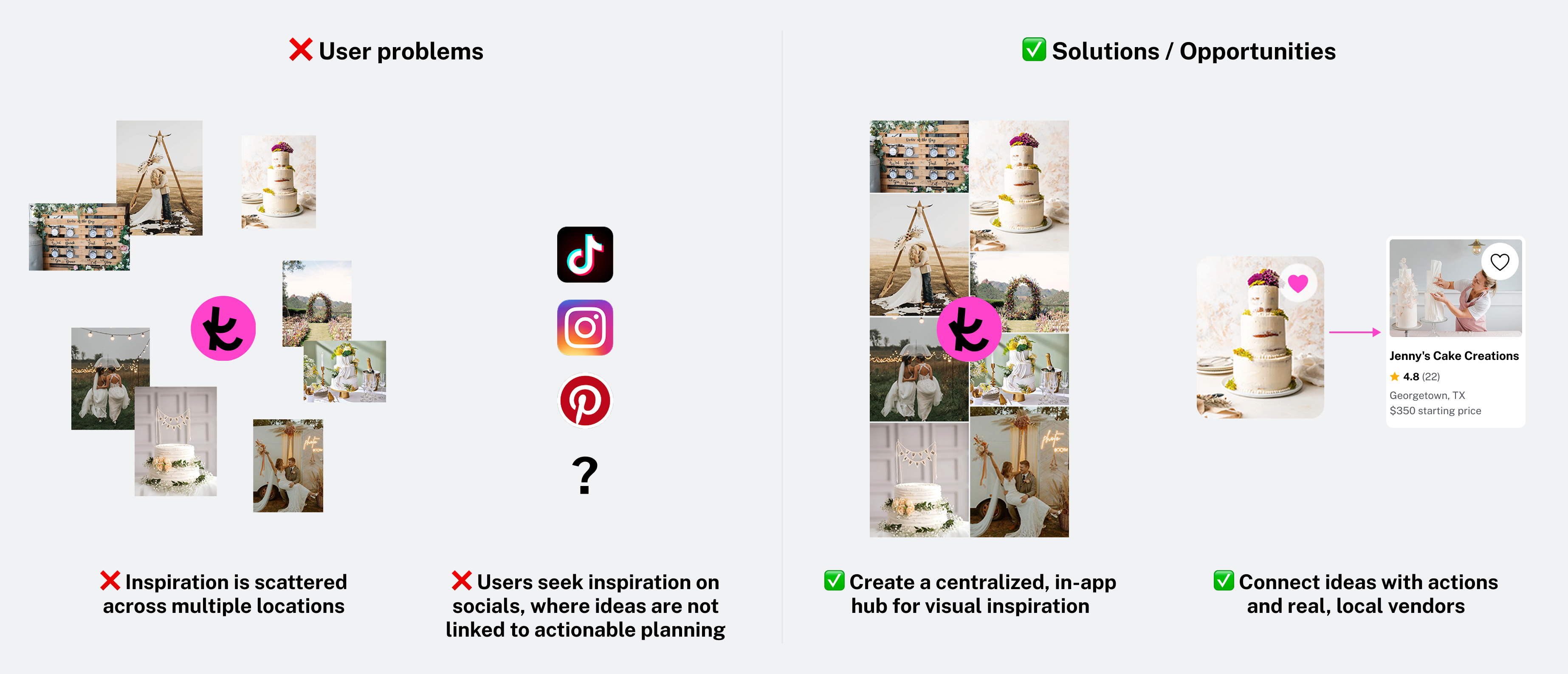
The problem
Couples bounce between many platforms, and this fragmentation makes planning harder. Among user’s pain points:
- Inspiration is scattered across different section on TK (many of them not even included in our iOS app)
- Users search for inspiration in external platforms, such as Pinterest, Instagram and TikTok.
- These platforms are disconnected from planning workflows, and translating inspiration into action (e.g., booking a vendor) is difficult.
As a result, users find ideas elsewhere and return only for planning tasks — limiting engagement, retention, and marketplace actions.
Hypothesis
- Engagement & Retention: If we introduce a curated inspiration feed inside the app, couples will engage more deeply and visit more frequently.
Why it matters: Higher engagement increases retention and session value. - Marketplace Impact: If inspiration is connected directly to vendors and planning tools, we will drive more storefront views, leads, and bookings.
Why it matters: Turning inspiration into action grows our vendor marketplace (GMV, leads, HVAs).on personalization.
Discovery & Validation
With Product and Data, we validated the opportunity by analyzing:
- Market trends highlighting the rise of visual discovery platforms.
- Content analysis demonstrating how inspirational content on the website was driving vendor actions.
- Mobile usage analysis identifying gaps in mobile consumption behavior.
- In-app experience review uncovering the lack of actionable inspiration in-app.
Insights confirmed the need to bring content into the app and connect it directly to planning tools.
Additionally, I conducted an exhaustive competitive benchmark to understand how leading platforms structure their feeds—focusing on UI patterns, navigation behaviors, and key user interactions.
Initial Success Metrics
- Success Metric: Engagement → +15% session time; +15% favoriting rate (9% → 10.3%).
- Guardrail metrics: Unique Booking Opportunity, Unique Lead Submitters
- Informative Metric: Retention (Returns 7 days), # Favorited Vendors
TK Feed: Key Features
We aimed to create the only wedding-specific feed that doesn’t just inspire — it helps couples plan.
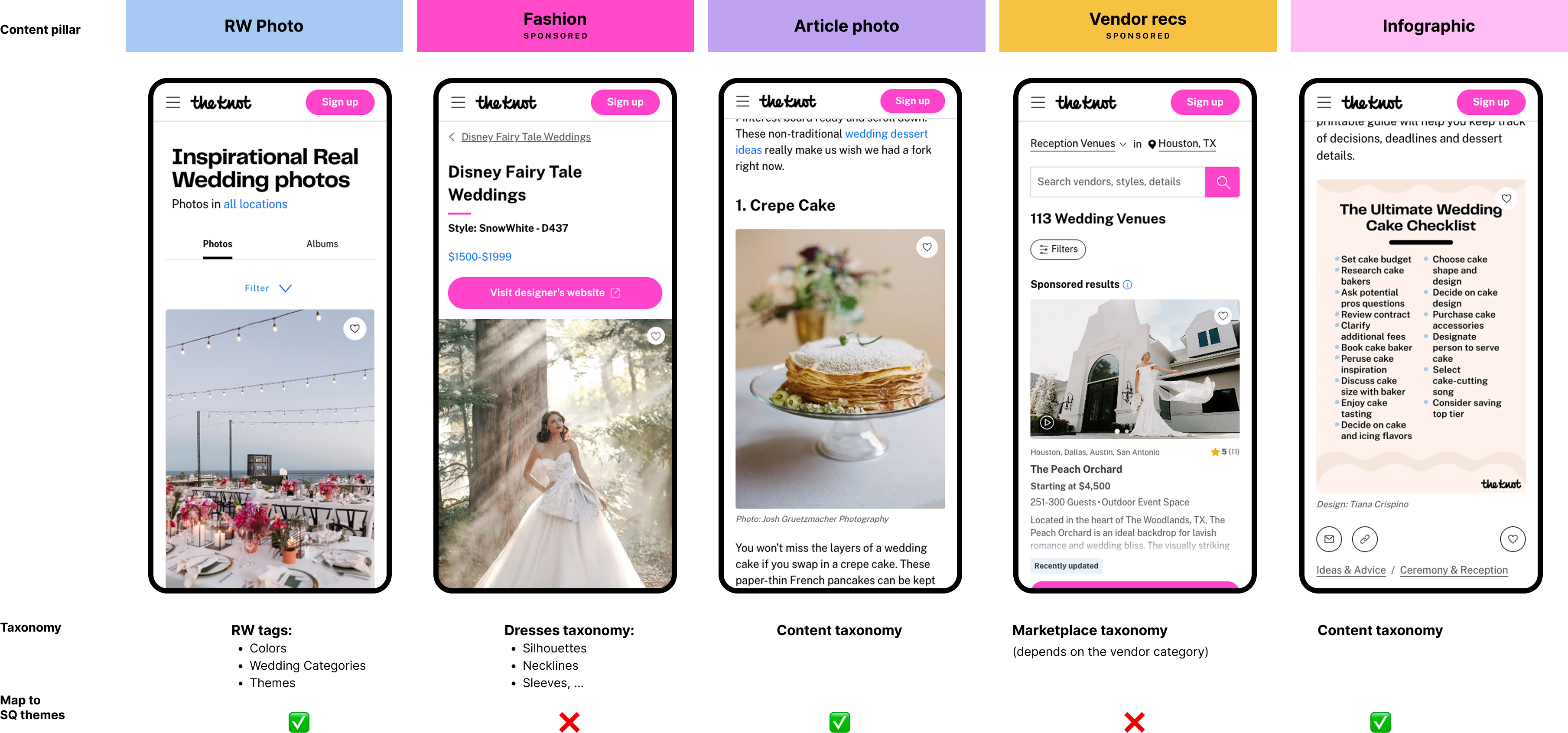
- Five content pillars: Real weddings, Wedding dresses, Marketplace Vendors, Article photos, Infographics.
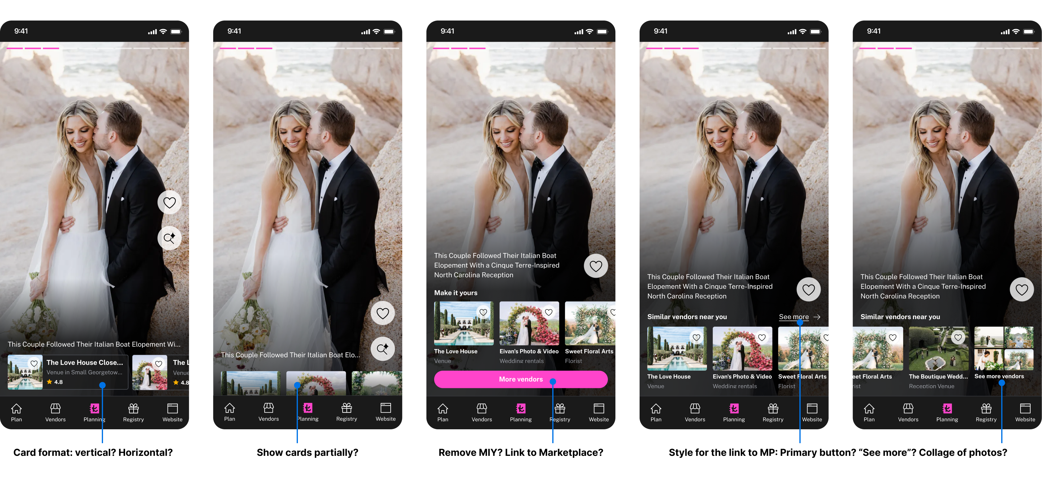
- Fill the gap between inspiration and action: for each photo, couples can see vendor recs.
- Personalized: Feed adapts to wedding location, budget, style, and planning stage (rolling out in 2026).
The experience had two key actions:
- Save ideas as favorites (for users + data for better recommendations).
- View local vendors who can bring that specific idea to life (Make It Yours model).
Defining the Content Strategy
I collaborated with Data and Editorial to define the types of content supported in the feed and the sorting logic based on number of favorites (higher success likelihood).
‼️‼️ Challenge ‼️‼️
Personalizing the Feed Through Style Quiz Results
We initially aimed to personalize the Inspiration Feed based on each user’s Style Quiz results. To explore feasibility, I analyzed the taxonomies across all content types — real weddings, fashion, vendor photos, articles, and infographics — and uncovered major inconsistencies.
Key Constraints
- Low adoption: Only ~20% of users take the Style Quiz, making it an unreliable foundation for personalization.
- Content mismatch: Several content types couldn’t be categorized into the Style Quiz themes.
- Privacy limitations: A significant portion of users opt out of data tracking, preventing personalized feeds.
Outcome
Given these constraints, full personalization was deprioritized. Instead, we shifted to a high-quality curated feed for launch, with personalization planned as a future enhancement (early 2026).
Design Approach & Key Decisions
Leveraging Industry Best Practices
To ground the experience in familiar yet modern patterns, I conducted a benchmark of leading platforms known for high-performing feeds (e.g. Instagram, TikTok). These insights informed our principles for hierarchy, card density, and interaction expectations.
UX Research Throughout the Process
I ran iterative UXR sessions on early prototypes. A key finding: users didn’t realize the feed was scrollable, causing confusion and premature drop-off.
💡 Design solution: I introduced a lightweight onboarding animation — a subtle upward nudge and parallax effect — that immediately revealed scroll behavior without interrupting the experience.
Improving Favorites Discoverability
During testing, the “Saved inspiration” and “Saved vendors” flows created confusion because they lived in different places.
💡 Design solution: I unified the mental model by introducing a contextual snackbar that appears right after a user favorites something, pointing them to the exact location of that specific item.
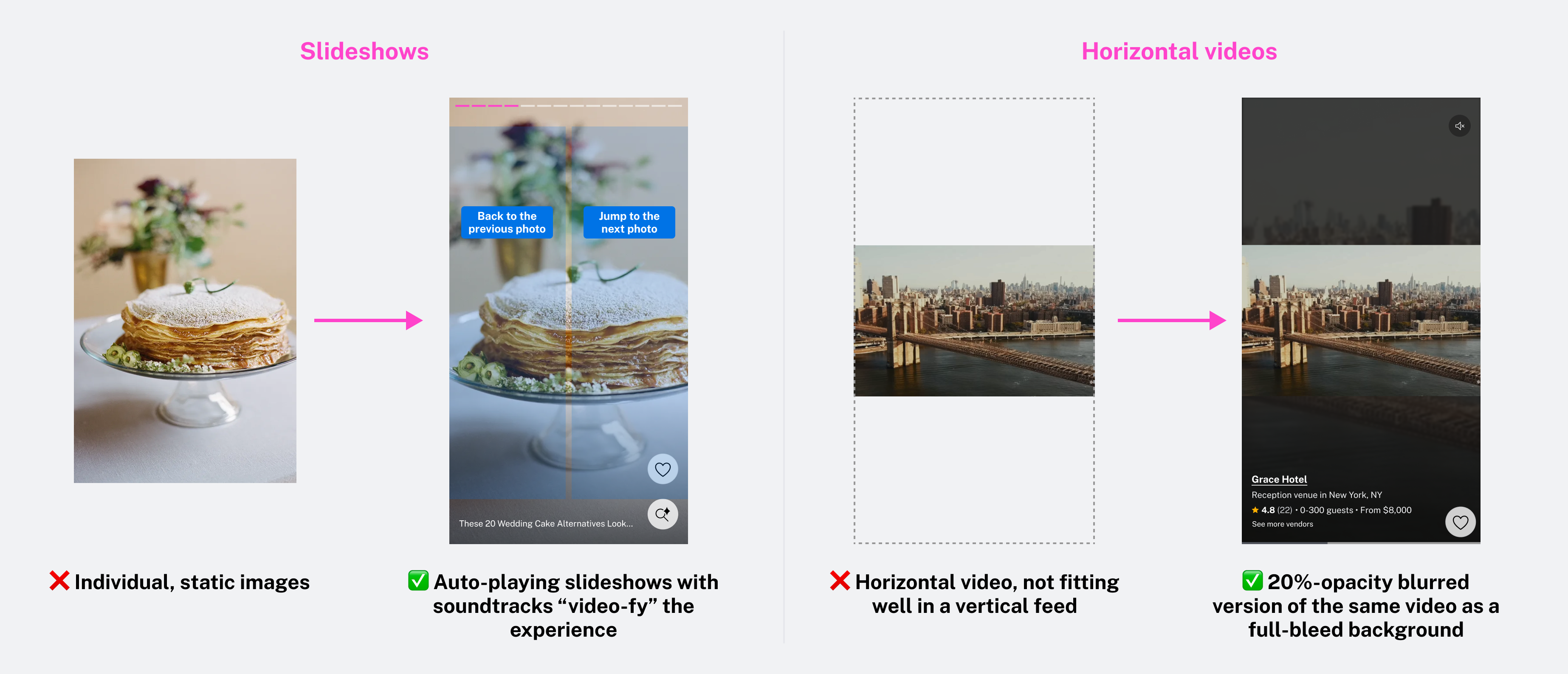
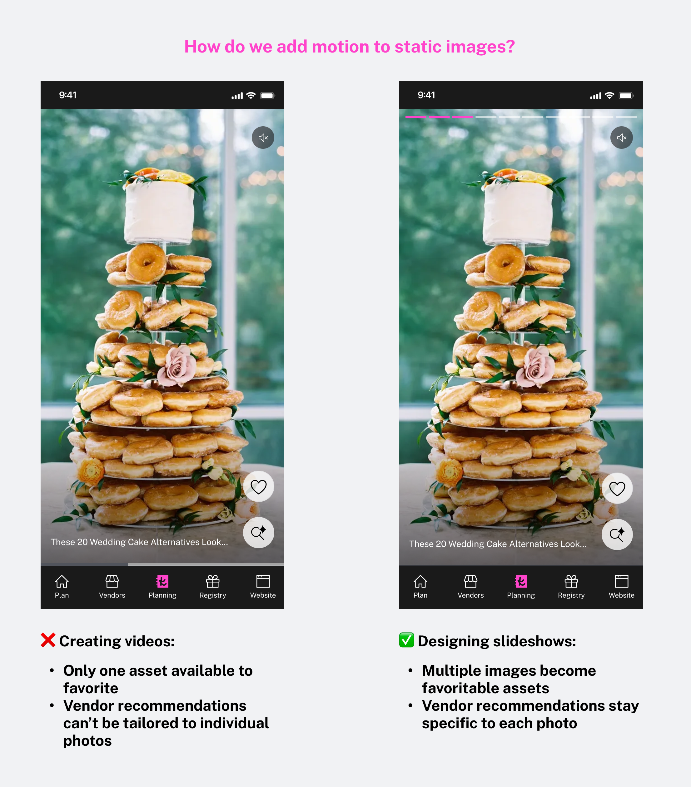
Optimizing the Video Experience
- Most of our available assets were static images, which conflicted with the dynamic, video-forward experience we aimed to deliver.
💡 Design solution: I “video-ified” these assets by creating auto-advancing slideshows with smooth transitions and sountracks. This approach preserved visual quality while introducing motion, resulting in a more engaging and modern feed experience without requiring additional content production. - Vendor videos were often horizontal, which can feel awkward in a vertical feed.
💡 Design solution: To avoid cropping while retaining immersion, I designed a blurred-background treatment that gives videos a pseudo–full screen presence without taking over the UI.
Cross-team Negotiations
MVP Scope Reduction: Product leadership imposed a hard deadline for the development after design work had already begun. To meet the timeline, we had to remove videos and slideshows from the MVP. Although this was not ideal, we were able to preserve all planned content types by presenting them as static, individual photos, and secured commitment to reintroduce videos and slideshows as fast-follow iterations.
Legal Requirements: Legal requested adding “Sponsored” labels to all vendor and fashion cards. Because this was not used anywhere else in the app, it would have negatively impacted engagement and introduced bias into the experiment. My PM and I negotiated postponing the label until it could be rolled out app-wide, ensuring a fair and comparable experiment.
Pushing Back on “Videofying” Slideshows: Some stakeholders proposed converting slideshows into videos to create a more video-centric feed (compensating the exclusion of slideshows and videos from the MVP). I pushed back, recommending we keep individual photos instead because:
- It would reduce favoriting opportunities by up to 90% (e.g., 10 favoritable images → 1 favoritable video).
- It would break vendor recommendations, which were designed at the photo level and wouldn’t scale to video albums.
This ensured our MVP still supported our success metric (# of favorites).
Content Scalability
Video content availability was a major constraint. Marketplace videos needed manual QA from Editorial, which wasn’t scalable, and Editorial wanted to exclude any video longer than 1 minute based on social-media best practices. This would have eliminated nearly half of vendor videos, creating too small a content pool.
I proposed a more user-centric approach:
- Do not limit video length upfront, since wedding-planning intent differs from TikTok or Instagram.
- Collaborate with Data to track video length as an attribute, enabling us to learn how short vs. long videos perform and optimize later based on real user behavior.
We also elevated the QA limitations to leadership to spark a broader conversation around long-term scalability, aiming for an automated (AI-based) QA for marketplace videos to ensure quality without blocking content ingestion.
Late Change in Success Metrics
When the design process was nearly complete, leadership updated the experiment’s success metric to align with new business priorities. The new goal was to measure the number of users who favorited at least five vendors — a significant shift from our original engagement-focused metrics.
Because this change came very late, we had limited room to push back and needed to adapt quickly. To support the new metric without compromising the user experience, we optimized the feed to increase vendor visibility while preserving a sense of content variety.
Our solution was to increase the number of vendor cards from 2 to 3 within every 10 pieces of content, boosting exposure in a controlled, user-friendly way.
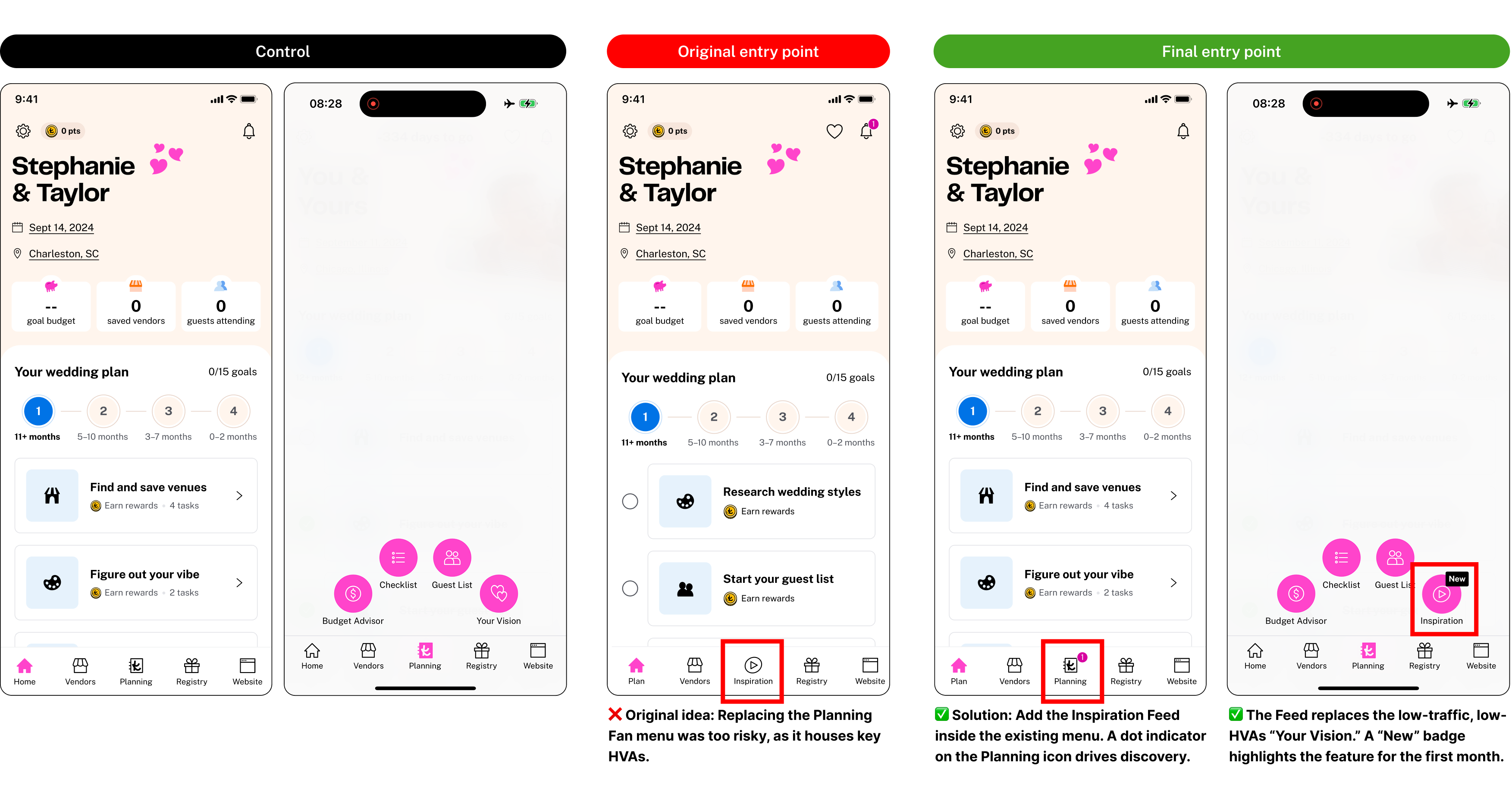
Entry Points & Experiment Setup
Entry points depended on other running experiments.
Additionally, we originally wanted the inspiration feed to replace an existing tab in the bottom navigation but we needed to compensate for HVA losses, making this a big risk for the experiment.
Solution:
- A less disruptive entry point
- Enhanced visibility with notification dots + “New” badge
Experiment rollout:
- 25% exposure (high risk) during 2 weeks to validate guardrails
- 100% release after confirming success
- Follow-up Experiment V2 for video content
The Results
The Inspiration Feed V1 experiment on iOS was declared a WIN 🎉 and rolled out to 100% of users.
Key Metrics:
- +6.9% average number of vendors favorited (KPI +0.2%)
- +7.9% average number of favorites added
- +8.2% UBOs (KPI +0.14%)
- 6% user interaction conversion rate
- 11% vendor favoriting conversion rate
These improvements demonstrate that actionable inspiration successfully drives marketplace outcomes.
Next steps
- Experimenting with additional formats (videos and slideshows).
- ML team preparing personalization models (early 2026).
- Featuring Paper and Registry products.
- On-Feed Vendor Cards: In order to serve vendor recommendations within the feed, we relied on the existing Make It Yours, a button powered by a visual-similarity model that opened a modal with similar local vendors. However, in the first experiment we saw that user interaction was unexpectedly low. I am now exploring solutions to embed vendor cards directly inline within the feed. This aligns with natural browsing patterns and potentially increases the amount of favorited vendors.
Key Learnings
- Align on timelines with leadership before starting design work. In this project, leadership set a go-live deadline after the design phase was already completed. This forced us to quickly descope functionality and deliver a version that the original design wasn’t intended to support. In future projects, securing timelines upfront enables us to design incrementally and intentionally, rather than cutting critical pieces late in the process.
- Ensure the MVP can actually validate the hypothesis. An MVP that is too minimal cannot effectively test what it’s supposed to prove. If the experiment returns negative results, the team risks abandoning the initiative without ever testing the real solution. Moving forward, it’s essential that the MVP includes the core elements needed to validate (or invalidate) the hypothesis with confidence.
- Flexibility in design is essential to adapt to late changes in success metrics or business priorities without compromising user experience.
Wrapping Up
This project required deep cross-functional collaboration across Product leadership, the Ads&Content squad (backend API), the iOS squad (frontend), the Growth squad (favorites and vendor recs), Data Science, and Legal.
I helped align diverse goals (from the Editorial and Ads teams), define a scalable content strategy, advocate for design quality, and ensure experiments fairly measured the feature’s true value.
The result of this team effort was a successful feature that:
- Drives business growth via more marketplace actions
- Supports couples with a seamless, modern, actionable inspiration experience
- Creates a foundation for personalization and richer content formats in 2026