This portfolio is optimized for larger devices. A minimum screen width of 1280px is recommended.
Optimizing article templates based on their JTBD
With 50% of new users landing on The Knot through editorial content, we redesigned article templates based on their specific jobs-to-be-done (JTBD)—from affiliate to sponsored content. By tailoring experiences to match intent, we improved usability, supported revenue goals, and empowered editorial teams with more flexible tools.
The Background
Content plays a pivotal role in user acquisition for The Knot. Roughly 50% of new users enter the site through the Ideas & Advice section, with 80% discovering us via Google Search. Notably, 75% of this traffic comes from mobile web, reinforcing the need for mobile-first design strategies.
The Problem
We were relying on a single, catch-all article template to support multiple editorial and business goals, including:
- High-Value Actions (HVAs)
- Affiliate revenue
- Editorial content
- Sponsored content
- Video integrations
This one-size-fits-all approach diluted performance across all fronts. The UX was not optimized for conversion, nor was it tailored to the specific intent of each content type.
The Objective
To improve both user experience and conversion rates, we set out to design and implement dedicated article templates aligned with each editorial strategy.
The Approach
We began by analyzing The Knot article performance. This involved:
- Mapping all article components and CTAs
- Evaluating article performance through metrics like CTR, bounce rate, and revenue impact
- Conducting stakeholder interviews with editorial, GMS, and product teams
- Gathering data about volume and traffic by content category
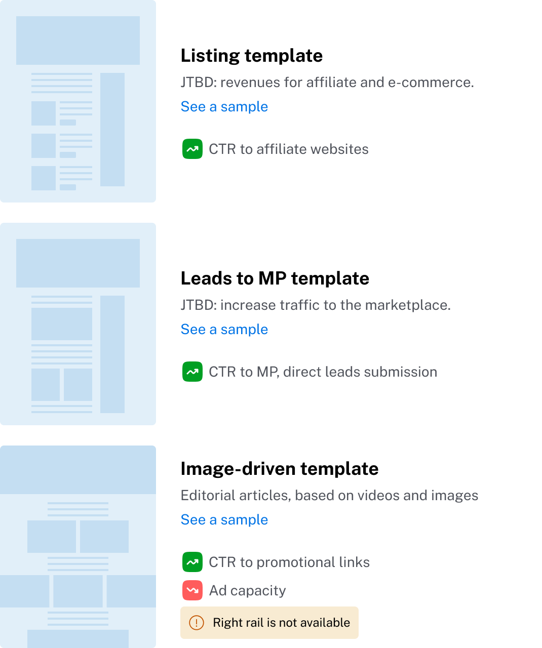
After prioritizing templates with the product team, we focused on two high-impact types: Affiliate and HVA (Marketplace-focused) articles.
Template 1
Affiliate Template Redesign
Research & Insights
We conducted a competitive benchmark to understand affiliate best practices and a usability test on the existing template to gather user feedback.
Key findings:
- Users want product reviews for confidence in purchase decisions.
- Long articles caused friction; users requested filters (by category, price).
- Customizability and originality in gifts were highly valued but often hidden until reaching affiliate sites.
- Ads were viewed as intrusive, especially when not aligned to the article content.
The Solution
We created a modular affiliate template addressing these pain points, with improvements in two main areas:
Information Enhancements:
- Added reviews from affiliate sites.
- “Style It With” section to cross-promote products
- Adjusted image width to shorten scroll depth
- Clearer item separation with index numbers
- Badges for key product features (e.g., sustainable, customizable)
Navigation Improvements:
- “Browse All Items” modal, improving scanability and access to the full list of products
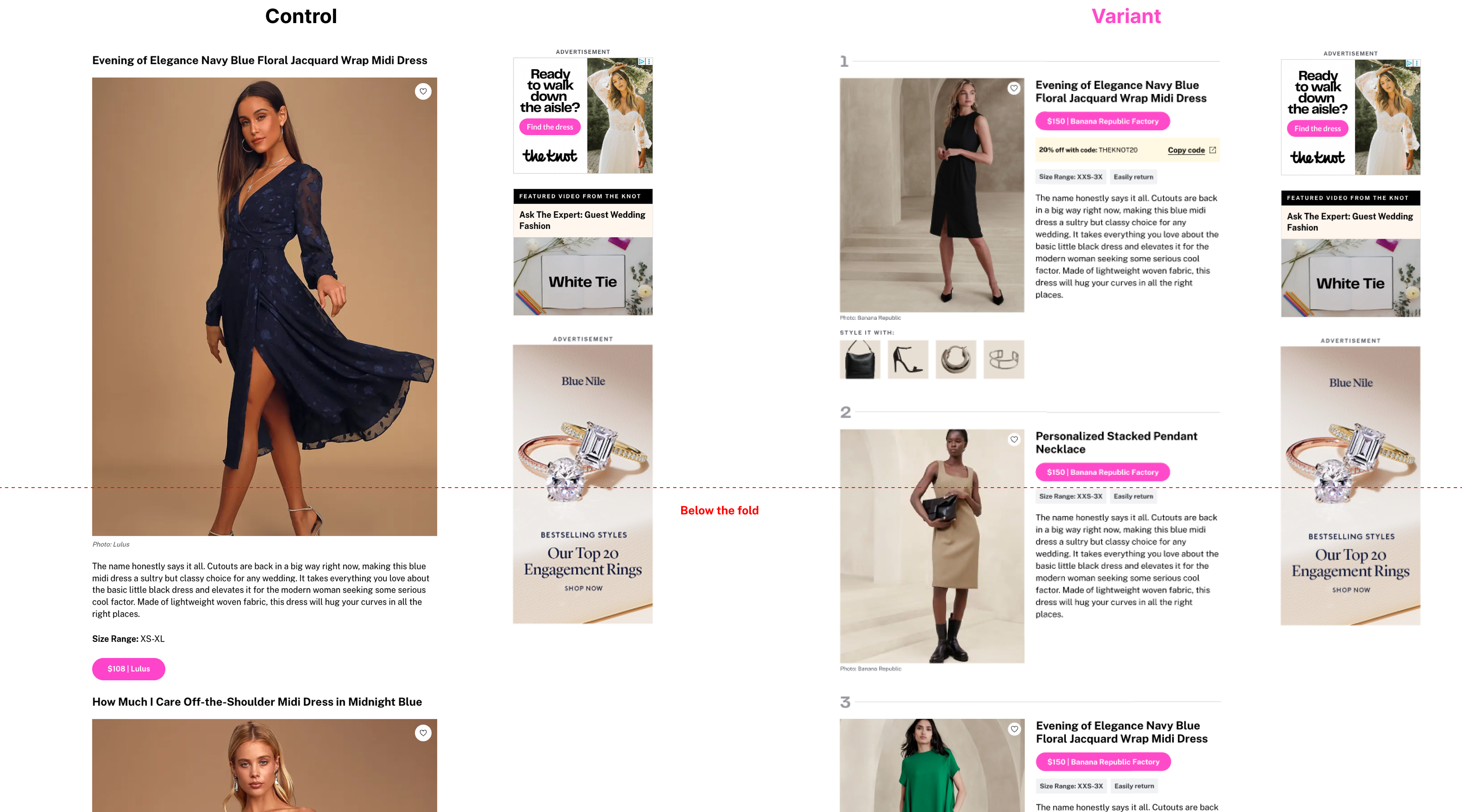
Ad Monetization Considerations
We anticipated reduced display ad impressions due to:
- Shorter articles (reduced scroll, impacting the ad capacity).
- The modal bypassing inline ad zones.
To compensate, we introduced native ad units designed to seamlessly blend into the article layout—not just in look and feel, but also in context and tone. These ads were carefully crafted to feel like a natural extension of the editorial content. For example, in affiliate gift listicles, placements included messages like “Fly high with the perfect gift” by Delta Airlines or “Gift memories with top-class hotels” by Marriott. These native ads were strategically placed:
- Every six products in the list.
- Inside the modal.
Testing & Outcome
We launched an A/B test with CTR and revenue as our primary success metrics. The initial results were mixed— 25% increase in CTR, but a 50% drop in revenue. These outcomes appeared inconsistent, prompting a deeper analysis. We uncovered two key issues:
- Identical affiliate codes were used in both the control and variant groups.
- Some affiliate partners didn’t support code-level attribution, making it impossible to differentiate between test variants.
As a result, many conversions from the variant were incorrectly attributed to the control, significantly skewing the data and undermining the test’s validity. We’re now working closely with the affiliate team to clean up and restructure the tracking codes, ensuring proper attribution before rerunning the experiment for more reliable insights.
Template 2
HVA Template (Marketplace Leads)
The Problem
Articles designed to inspire and guide couples through planning weren’t driving conversions on high-value actions (HVAs) such as:
- Driving traffic to the vendor storefronts
- Favoriting vendor storefronts
Goals and metrics
Our main goal is driving traffic to Marketplace, being the CTR from articles to vendor storefronts the main metric.
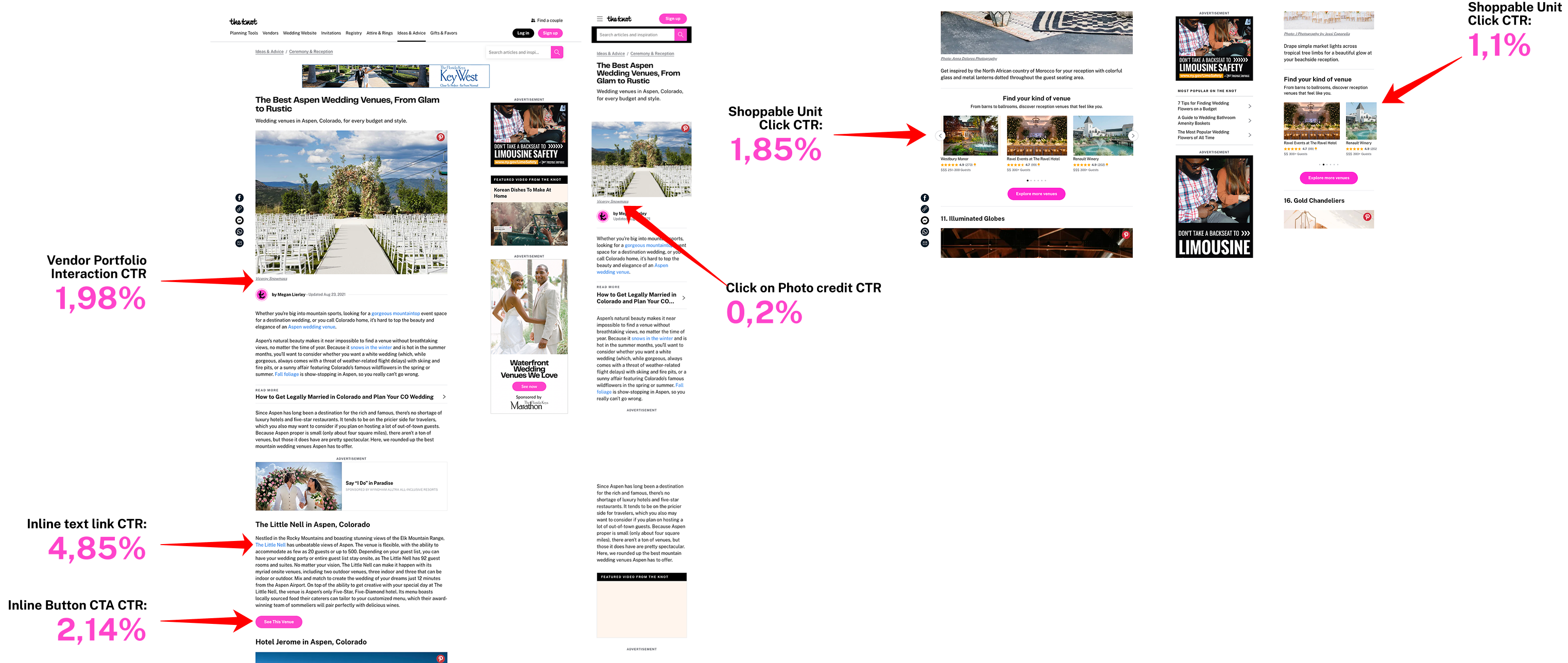
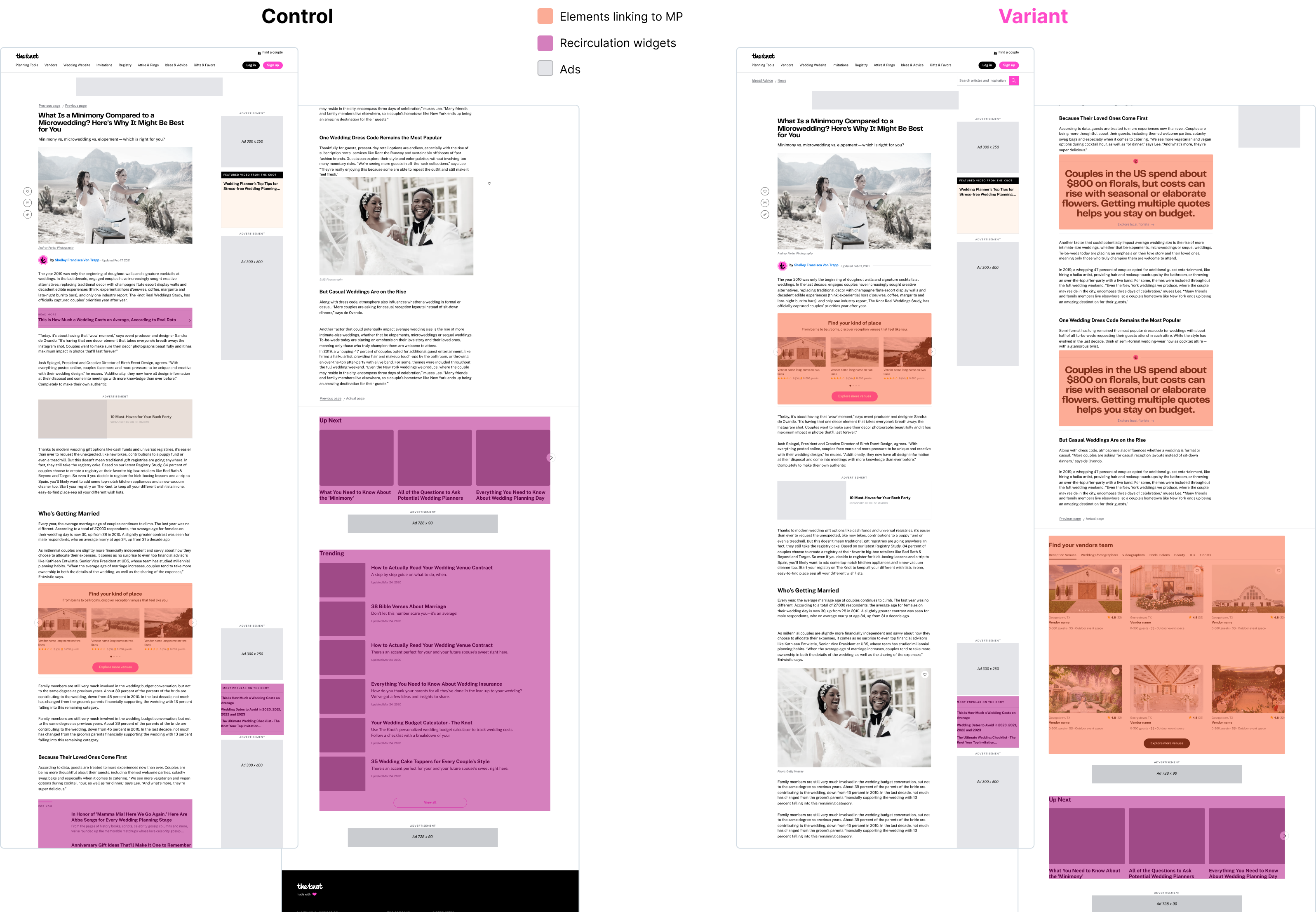
To align the template with our goals, I conducted a visual audit of all components, using a color-coded system to categorize them by purpose:
- Orange: Elements driving traffic to the MP
- Gray: Ad placements
- Purple: Recirculation widgets linking to other articles
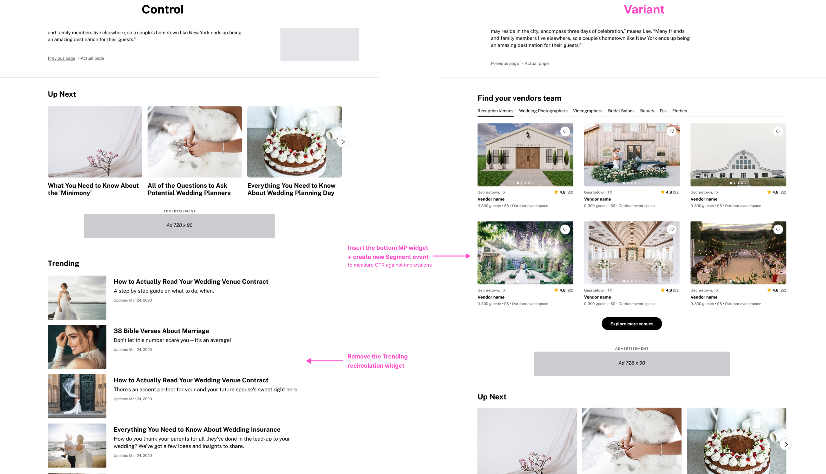
The analysis showed that the template was heavily dominated by gray and purple, meaning most space was dedicated to ads and article recirculation. While ad zones (gray) were essential for revenue and untouchable, recirculation elements (purple) were taking up valuable space that could be better used to support Marketplace engagement. By selectively replacing or repositioning these widgets, we found a smart way to increase “orange” real estate—driving more traffic to the MP—without impacting ad performance.
To optimize articles for vendor engagement, I designed a new modular template that introduced several strategic changes, listed below.
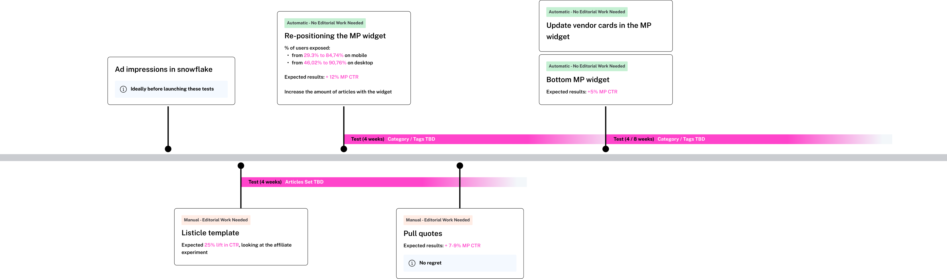
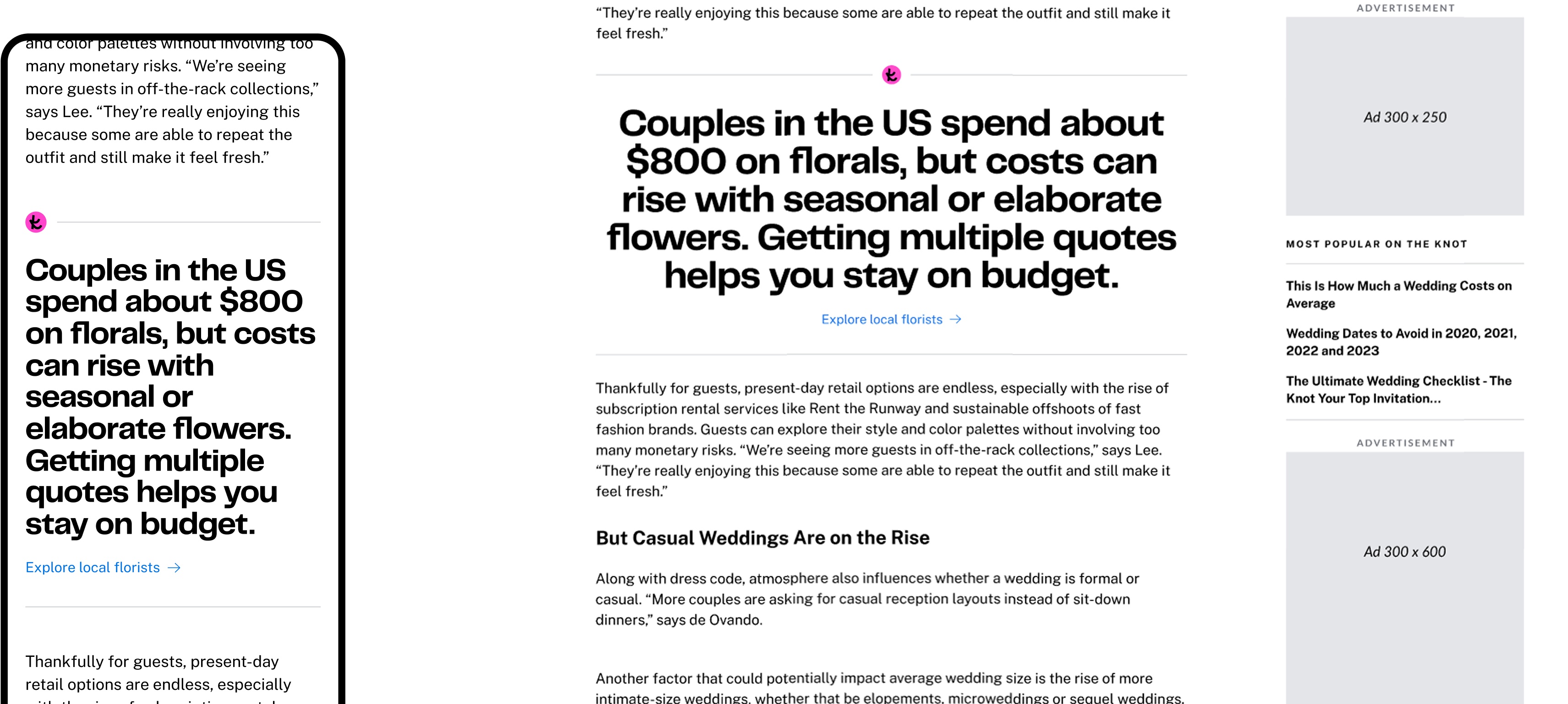
Pull Quotes
I introduced visually distinct pull quotes embedded within article content to:
- Highlight concise, actionable vendor tips or planning insights.
- Break up long-form text for improved readability and scannability.
- Serve as contextual entry points to the Marketplace, increasing opportunities for vendor discovery.
These pull quotes are particularly effective in long, text-heavy articles, where they help surface key information and guide users naturally toward planning actions like exploring local vendors.
Replacing the First Inline Recirculation Widget with a MP Widget
The original template included an early widget promoting other articles—counterproductive when the goal is to drive traffic to vendor storefronts. I replaced this with an existing high-performing MP widget, which:
- Surfaces local vendors based on the user’s IP address.
- Helps shift user flow from content to conversion, rather than recirculation.
Based on data analysis, we anticipate that repositioning the widget higher on the page will significantly boost its visibility—increasing user exposure from 29% to 85% on mobile, and from 46% to 90% on desktop.
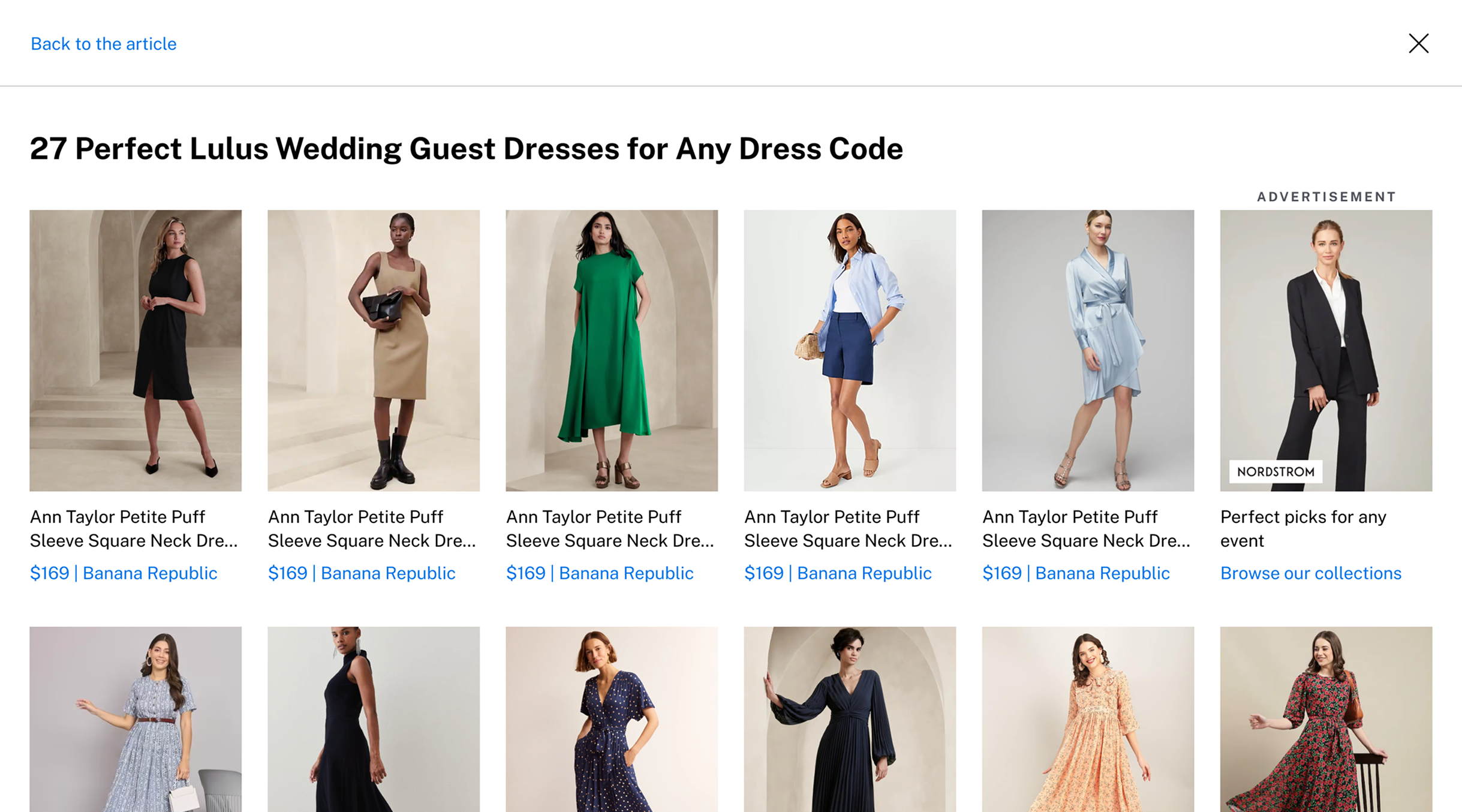
Vendor Listicle Layout Redesign
For articles listing vendors (e.g., “Top Photographers in NYC”), we optimized the layout to align with MP storefronts. Inspired by the affiliate template—where similar changes led to a 25% CTR lift—I implemented:
- A more structured format featuring multiple vendor images, pricing, and ratings.
- Direct data integration from the MP, ensuring up-to-date and accurate vendor information.
- A consistent visual experience between the editorial article and the vendor storefront, which eliminated the previous disconnect caused by manually curated content.
This change reduced editorial overhead and improved content reliability while creating a more engaging and informative vendor discovery experience for users.
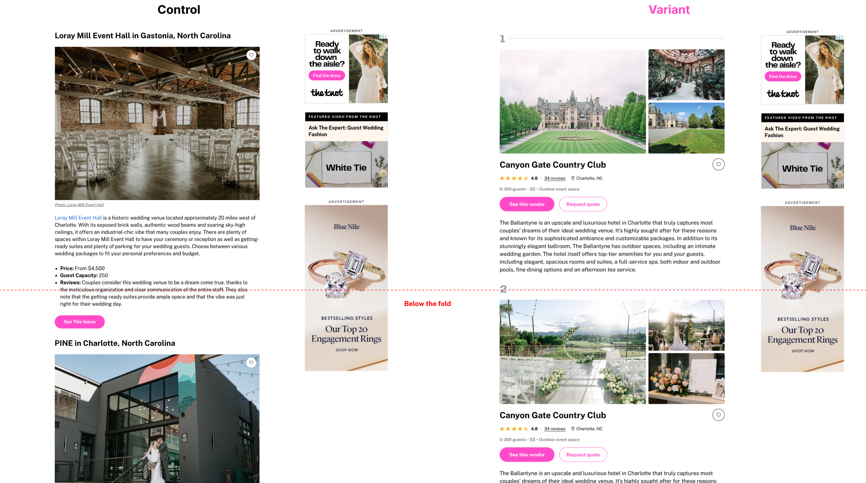
Redesigned Bottom Section with a Larger MP Widget
To maximize the use of underutilized page real estate at the end of articles, I designed a larger widget that allows users to toggle between vendor categories (e.g., venues, florists, photographers). Due to its size, the widget had to be placed at the bottom of the page—where visibility is naturally low.
To ensure we could gather meaningful insights from this low-exposure area, I partnered with the data team to propose the creation of a new Segment event that would measure CTR against actual impressions (i.e., views of the widget) rather than overall page visits. This allowed us to test new ideas in this low-exposure (less risky) zone without negatively impacting overall article performance.
Implementation Strategy
Since the template consisted of multiple independent components, prioritization was key. I created a proposed implementation roadmap to initiate cross-functional alignment between product, engineering, and editorial teams. This roadmap outlined each component’s dependencies and estimated LOE, with the goal of identifying quick wins versus long-term investments to drive early impact. The new HVA template is currently undergoing A/B testing at the time of writing, with early indicators showing promising improvements in vendor visibility and engagement.